-
DOR’s new Job Tax Credit reporting policy: Replace county-level sunlight with statewide fog
(Correction: This post originally reported that the Department of Revenue’s revised Job Tax Credit reports showed $2.4 billion in tax credits for roughly 740,000 jobs for tax years 2022 through 2025. Those figures were wrong, and the error was mine: in combining DOR’s revised reports into a single spreadsheet, I inadvertently double-counted the bottom-line row,…
The PCI Files
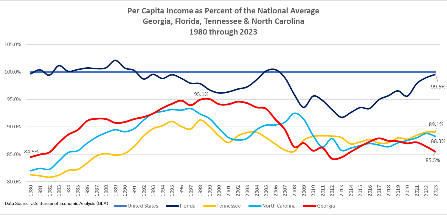
For more than a year, TIGC has been focused in no small part on the inexplicable collapse of Georgia’s per capita income (PCI) performance. We’ve documented that disproportionate shares of our population and huge swaths of our geography have fallen into the bottom national ranks for various important economic metrics, including — in addition to PCI — median household income, poverty and gross domestic product (GDP) per capita. We’ve come to regard this as a major part of the TIGC story and plan to maintain a sharp focus on it.


Politics
Articles from other media about important rural issues


Golden Oldies
A collection of vintage TIGC stories that still attract reader interest


Politics
-
Elections really do have consequences
Pregnant women in Franklin County and neighboring areas of northeast Georgia can no longer deliver babies at St. Mary’s Sacred Heart Hospital just outside Lavonia. But Georgians and, indeed, all Americans now have the privilege of being able to buy gun silencers without having to pony up a $200 tax. How, you might wonder, are…
-
Carter’s funeral and Trump’s inaugural: Bookends to a troubled half-century
After nearly two years in hospice care at his home in Plains, Ga., Jimmy Carter passed away Sunday afternoon at the age of 100. His family had said a few months ago that the nation’s 39th president was set on hanging on until he could cast his vote for Kamala Harris over Donald Trump. He…

-

Early TIGC notes on the 2020 election and the two political Georgias
Trouble in God’s Country’s preliminary take on Tuesday’s still-being-counted presidential election results: First, Georgia’s overall political map won’t change much if at all. President Trump, the Republican incumbent, and Democratic nominee Joe Biden are carrying the same counties their parties have carried in the past few election cycles, as this map illustrates. Trump will carry…