The Georgia House Rural Development Council begins its seventh year of deliberations on August 29th in Macon. Created in 2017 by the late House Speaker David Ralston, the group — made up primarily of rural legislators — has met several times each year since then and generated annual reports and legislative recommendations.
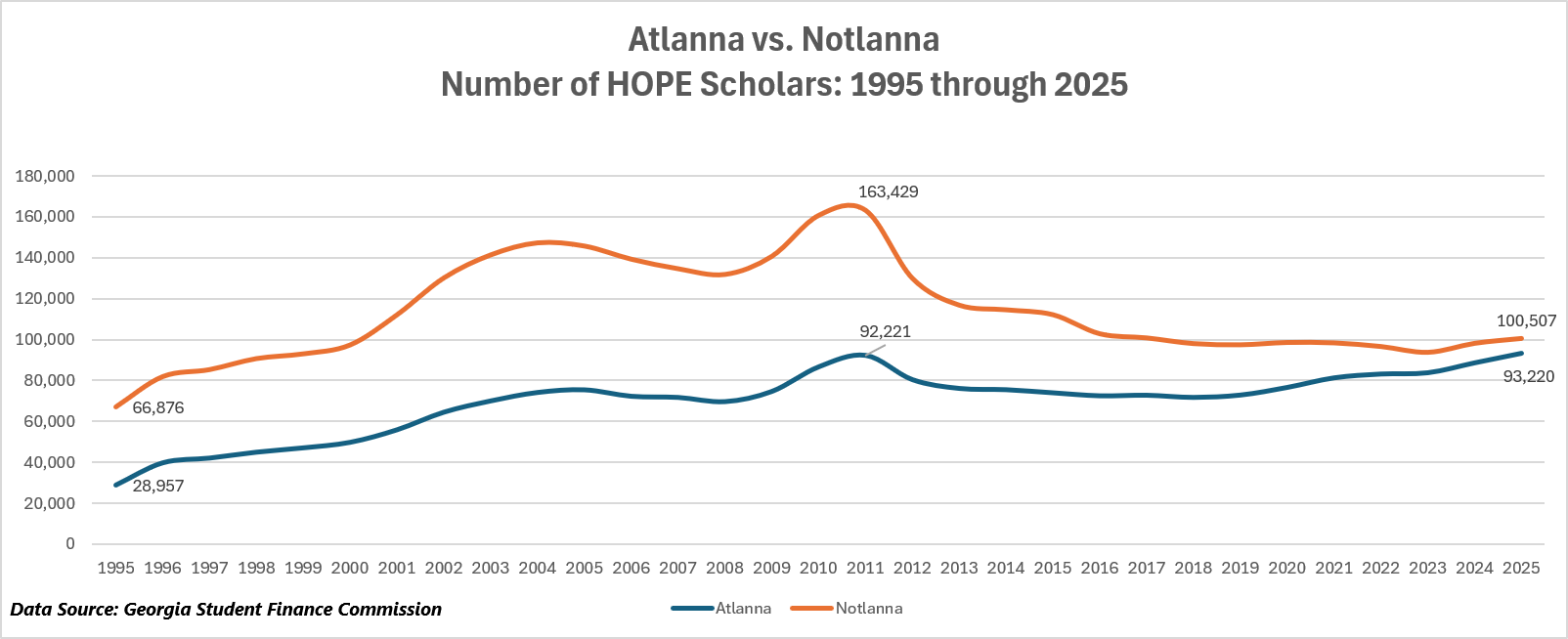
Despite these efforts, however, things have gotten worse. The gaps between what I now call “Atlanna” (my 12-county Metro Atlanta region) and “Notlanna” (everywhere else) have grown demonstrably wider. This is true for economic prosperity, educational attainment, and health status, with Notlanna getting an ever-shorter end of the stick.
Today, in my ongoing efforts to be helpful to our political leaders, I offer a quick primer on some economic metrics they may want to attempt to improve. The key takeaway here is that no matter what metric you consider, way too many Georgians seem to be stuck at the bottom of the national pile.
We’ll start with per capita income (PCI). As I’ve written before, improving the per capita income of the state’s citizens was once an important strategic economic development objective. Governor Joe Frank Harris, who took office in 1983, and his commissioner of Industry, Trade & Tourism (now the Department of Economic Development), the late George Berry, made it a priority and launched what turned into 20 years of nearly unmatched progress. During that period, Georgia’s per capita income rose from 84.5 percent to 95 percent of the national average and we moved up in rank from 38th to 25th; only Vermont did better over this 20-year period. In the next 19 years, however, Georgia lost all that ground; the state’s PCI fell back to 87 percent of the national average and our ranking dropped back to 38th. Over the course of that 19-year slide, only one state — Delaware — did worse.
But that’s only part of the PCI story. The other part has to do with the widening divide between Atlanna and Notlanna and the fact that hugely disproportionate shares of Georgia’s population are falling into the bottom ranks of the nation’s economy and getting stuck there. In analyzing PCI and other economic data, I’ve ranked every county in the nation and sliced them into quartiles.

In 2021 (the latest year for which we have data), the bottom national quartile for PCI was made up of 778 counties that were home to 25.3 million Americans. Of those 778 counties, 105 were Georgia counties (far more than any other state), and those counties were home to 3.2 million Georgians (more than any other state except Texas). Except for the coastal counties, that includes every last acre of east-central and southeast Georgia, a solid dark-red block of 51 counties. Many of those counties are clustered near the very bottom of the national list; indeed, Wheeler County ranked dead last, 3,112th out of 3,112 counties in this federal dataset.

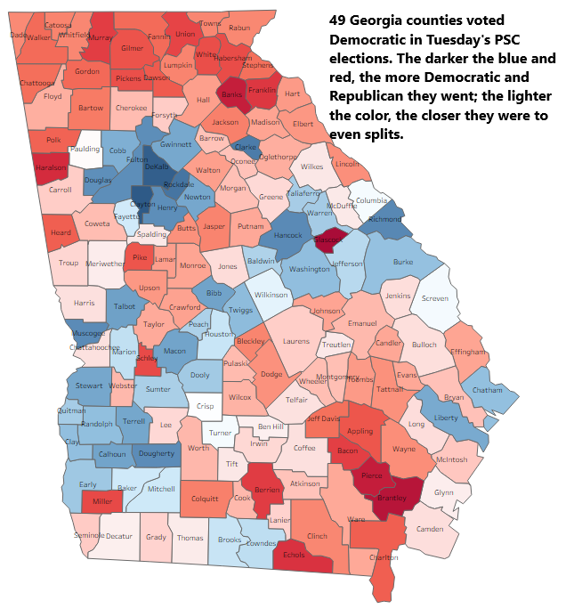
Next, Median Household Income. Median Household Income is a well-recognized indicator of income and poverty. Here again, Georgia has a disproportionate share of its geographic territory and population seemingly stuck in the bottom national quartile for this metric as well. Eighty-two of Georgia’s 159 counties are in that bottom quartile, and all but a handful are located below the gnat line (as the map at right illustrates). The only state with more counties in this bottom national quartile is Texas, which has a total of 254 counties; 83 of its counties were in this bottom quartile.
On to Gross Domestic Product (GDP). GDP has historically been calculated at national and state levels to track the size and growth rates of those economies. In 2017, however, the U.S. Bureau of Economic Analysis (BEA) began generating gross domestic product data at the county level. It’s useful here in calculating two county-level metrics: year-over-year growth in GDP and GDP per capita.

We’ll start with growth, and here the picture is a little better. But one unhappy takeaway from this map is that it puts a bright spotlight on the southwest Georgia counties whose economies suffered a significant contraction from 2020 to 2021. Almost as troublesome is the cluster of counties in southeast Georgia. Nine of the counties in that contiguous cluster suffered downturns, and three others — Brantely, Ware and Charlton — were right on the bubble.
And where GDP growth is concerned, a longer-term perspective may be useful. This table details GDP growth between North Georgia and South Georgia over the past five years:
| Region | 2017 GDP | 2021 GDP | Pct Change |
|---|---|---|---|
| North GA | $396.0 Billion | $441.6 Billion | 11.5 |
| South GA | $127.9 Billion | $134.1 Billion | 4.8 |
For the purposes of this table, North Georgia is made up of the 12 counties in TIGC’s Metro Atlanta region and 41 other counties outside Atlanta and north of the gnat line. South Georgia is made up 106 counties in TIGC’s Middle, South and Coastal Georgia regions. Some 88 percent of Georgia’s economic growth over the five years from 2017 through 2021 took place in North Georgia, and 76 percent of the state’s economic output is generated north of the gnat line.

The second county-level GDP measurement — GDP per capita — produces a picture (and a map) that is similar in some ways and different in others. One similarity here is that Georgia still has more counties than any other state — 83 — in the bottom national quartile and more people — 2.6 million — than any other state except Texas. One difference is that Georgia’s bottom quartile counties aren’t as concentrated in the southern half of the state as we’ve seen with other metrics; they tend to be scattered more or less evenly across the state (as this map to the left indicates).
It’s also worth acknowledging that GDP per capita may be of somewhat limited value as a county-level metric. GDP per capita is generally regarded as a fair measure of quality of life. That’s probably true at a state and national level, but I don’t think it’s necessarily so at an individual county level. It’s not difficult to scan the map above and identify situations where a suburban, bedroom county might have a relatively high per capita income but a low GDP per capita; the urban county they adjoin will invariably have a higher GDP per capita and perhaps a more modest PCI. Many of those suburbanites are earning their higher wages in the urban counties and contributing to their larger GDP per capita number.

Finally, poverty. Here again, a huge swath of the state’s geography — 87 counties — is mired in the bottom national quartile for this category, more than any other state. The vast majority, as this map shows, are south of our fabled gnat line. Georgia’s Bottom Quartile counties are home to 2.6 million Georgians and the overall poverty rate for those 87 counties is 20.9 percent. In contrast, the poverty rate for the 17 Georgia counties that made the Top Quartile is 8.2 percent. The chasm between the county with the lowest poverty rate and the highest is nearly 30 points: Forsyth County, in the northern Atlanta exurbs, posted a 2021 poverty rate of 5.3 percent and ranked 28th nationally; in deep southwest Georgia, meanwhile, Calhoun County’s poverty rate was 34 percent and it ranked 26th from the bottom of the national list.
If this year’s HRDC can make any progress on any of these economic metrics, they will have earned their per diems.
© Trouble in God’s Country LLC


Leave a Reply