Tag: Rural Georgia
-
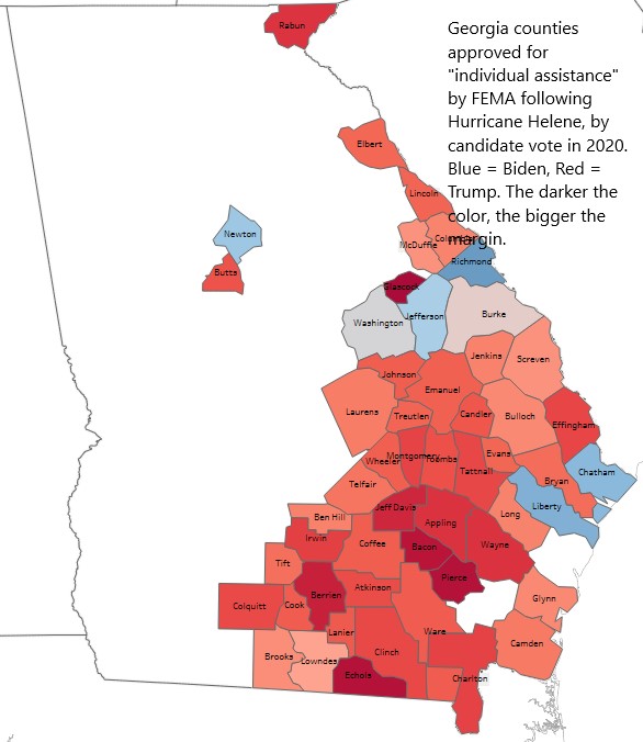
Helene depressed Georgia’s early vote by about 100,000 votes; impacted both parties but probably hit GOP hardest
An analysis of the impact of Hurricane Helene on early voting in Georgia.
-

CDC and AJC confirm what TIGC has been telling you for years: rural Georgians are dying younger than their urban cousins
The Atlanta Journal-Constitution led Wednesday morning’s print edition with a story headlined “Georgians in rural areas more likely to die early.” The story was based on a new report from the U.S. Centers for Disease Control and Prevention (CDC). I’m glad to see my long-ago employer covering this issue, but it’s not exactly like this…
-

Georgia vs. North Carolina, Chapter II: Educational Attainment
The second in a series of occasional posts comparing Georgia and North Carolina.
-

Comparing Georgia and North Carolina, Chapter I
For a while now, I’ve been noodling on a piece comparing Georgia and North Carolina. The two states are obviously neighbors and have a lot in common. Their economies are similar. Their populations are about as close to identical as you can get (10.7 million for Georgia vs. 10.6 million for North Carolina). They both…
-

One government program’s 30-year metamorphosis from well-intentioned economic development initiative to bloated tax giveaway
Recently I learned the General Assembly had established a joint House-Senate study committee to evaluate the various tax credits the state offers as economic development incentives. As it happens, I’ve been working off and on for a while now on a piece about Georgia’s Job Tax Credit (JTC) program and can save the committee some…
-

For the 2023 House Rural Development Council, a quick primer on the sad state of Georgia’s rural economy
The Georgia House Rural Development Council begins its seventh year of deliberations on August 29th in Macon. Created in 2017 by the late House Speaker David Ralston, the group — made up primarily of rural legislators — has met several times each year since then and generated annual reports and legislative recommendations. Despite these efforts,…
-

Mapping the rise and fall of Georgia per capita income performance
In my last piece, I summarized some of my recent research into the per capita income (PCI) “cold case” I’ve been noodling over for the past year or so and promised several follow-ups. This is the first of those. As a starting point, I thought it might be useful to spread some key data points…
-

More TIGC lessons from the 2022 governor’s race
Further notes from a deep (and continuing) dive into the results of Georgia’s 2020 General Election: Georgia is as divided politically as it is economically, educationally, and health-wise — and those divisions have all taken shape over roughly the same time period. I’ll start here with a little history lesson. In 1990, Lt. Governor Zell…
-

Rural Georgia never recovered from the Great Recession. Now comes COVID-19
There’s a persistent pattern I’ve noticed in various buckets of economic, population, and education data, but I’ve never fully connected the dots or taken a stab at suggesting what it all might mean. Now seems like a good time to do that. Rural Georgia — and especially Middle and South Georgia — got the crap…
-
Covid-19 may stir a perfect storm for rural Georgia
When I began work on this project some years back and came up with the title “Trouble in God’s Country,” I was thinking about things like the urban-rural divide in economics, education, healthcare, and politics. It never crossed my mind that a new plague might come along that would stir up what might be a…